Содержание:
What is the Pebble Time
The Pebble Time is the sequel to what was, it’s fair to say, the world’s first successful smartwatch. Pebble’s original wearable broke records on Kickstarter and became a poster child for crowdfunding, but it was far from perfect. It felt cheap, looked like a toy and had a fairly average monochrome display. Surprisingly, Pebble went back to Kickstarter to fund and launch the Time. Again, it broke records.
The Pebble Time looks to improve on its predecessor in almost every area. More care has been taken with the design and materials, the black and white display has been replaced with a colour one, and there’s a completely new operating system powering everything. But the Pebble Time just leaves us wishing for something more. The original Pebble had the luxury of novelty and newness, the Time doesn’t and that shows. It may be better in most ways, but so are the alternatives.
Pebble Time Screen
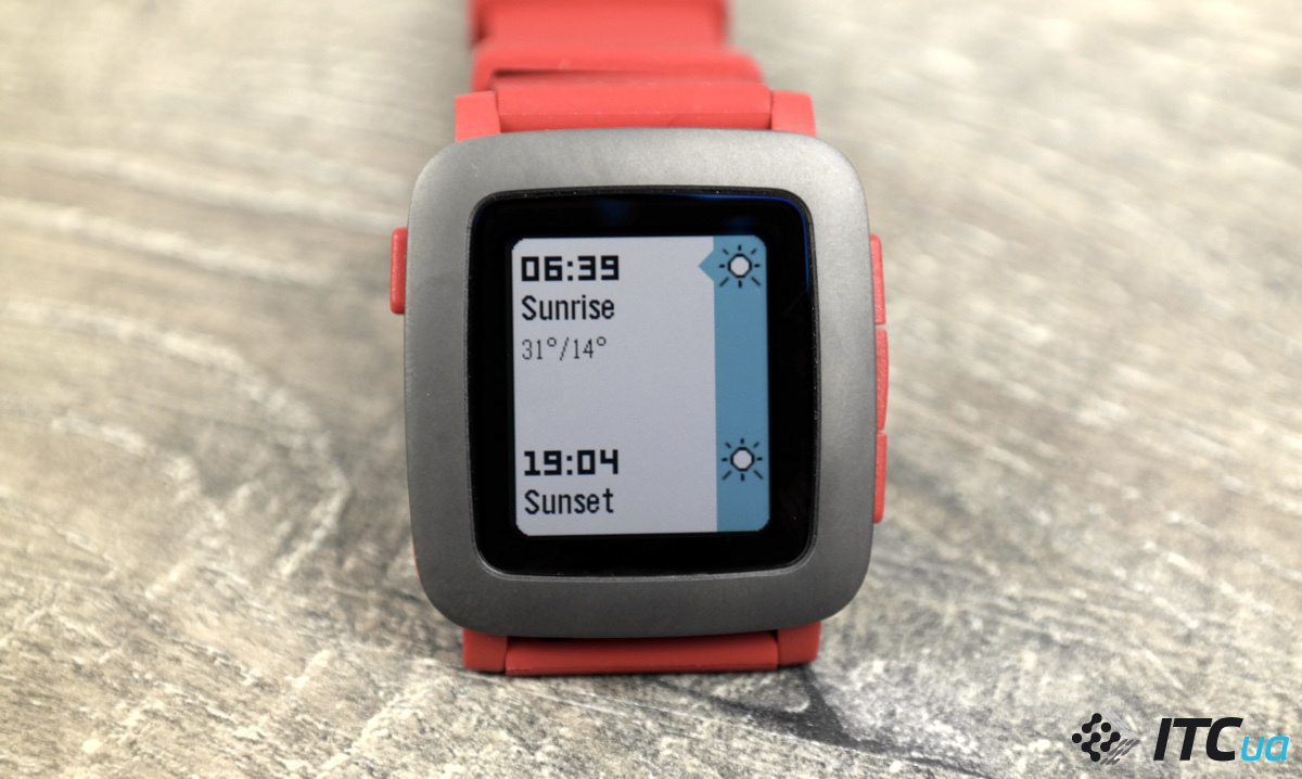
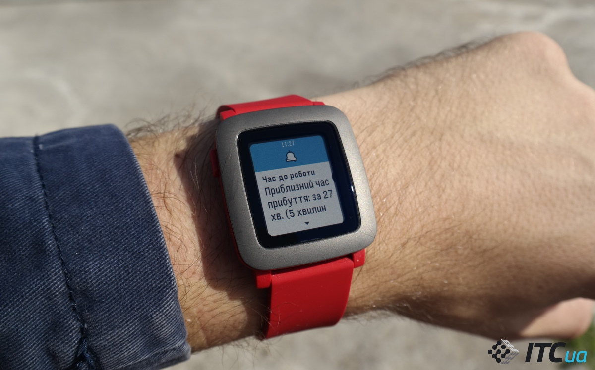
If there was one area where the Pebble fell even more behind its rivals, it was with its monochrome display. This was used to conserve battery, and while it was fine, it felt quite limiting as the device grew older. For the Time, Pebble has finally decided to embrace colour. Though if you’re expecting an LCD or OLED panel packing tons of pixels, you’re going to be disappointed. Instead, Pebble has opted to stick with e-paper. This gives you a screen that lacks the sharpness and colour variety of the competition, but that consumes very little power and is always on. That last point is key, the Pebble Time’s display is constantly visible whether or not you’re looking directly at it. This makes it look more like a real watch than simply a computer strapped to your wrist. Using e-paper should, in theory, also make the Pebble Time much better than other LCD smartwatches in direct sunlight. And yes, on the whole it is. It’s bright enough to see in daylight, though it suffers from poor viewing angles. Tilt it a little sideways when you’re outside and you’ll struggle to see anything.
Covering the display is 2.5D glass, giving it a slight curvature on the sides, which gives a good amount of protection from accidental scratches. In our time with the watch we haven’t seen any dings or scrapes appear, so hopefully it’ll end up being a tough, durable wearable.SEE ALSO: Apple Watch review
Дисплей
В Pebble Time используется 1,25-дюймовый Low Temperature PolySilicon (LTPS) дисплей с поддержкой 64 цветов, подсветкой и разрешением 144×168 точек.

Особенностью экрана и одним из основных достоинств часов Pebble является то, что он постоянно включён, но при этом потребляет меньше энергии. Это достигается за счёт технологии Memory in Pixel, которая на манер E-Ink, позволяет обновлять информацию на отдельных участках экрана, не тратя заряд аккумулятора на постоянные обновления.

Специальный поляризационный слой обеспечивает хорошую читаемость дисплея как под углами, так и на солнце. Да и в целом, читать информацию на экране Pebble Time вполне комфортно, даже несмотря на его небольшие размеры.
Pebble Time Features
Many of the features boasted by the Time have come straight from the previous Pebble, but they’ve been tweaked slightly to take advantage of that new colour display. Music controls are a great smartwatch feature, and they’re done well on the Pebble Time. You can play, pause and switch tracks, and unlike on the previous version you don’t have to pre-select which music app you’re using. The only music app we’ve had trouble getting the watch to recognise is Audible, though that app has a tendency to be a buggy mess anyway.

On Android you can dial down and filter the notifications that appear on your watch, whereas on iOS it’ll just beam everything through. That means your wrist probably won’t stop buzzing from the moment you wake up until the second you fall back to sleep again. One area that Pebble seems to have shied away from is fitness. There are a couple of gym and step-tracking apps, but none of these are pre-loaded and they come from the likes of Jawbone and Misfit rather than Pebble itself. There is an accelerometer built in, which provides the step-tracking, but nothing more than that. The idea here is that developers will build the aforementioned ‘Smart Straps’ to integrate fitness features like a heart rate monitor.
Pebble hasn’t really added any revolutionary features this time around, which is somewhat of a shame. We’re not talking about bolting on a camera or anything like that, but there just isn’t really anything to make us stand and up take note.
It is waterproof though, up to 30 metres. That means you can go for a swim and have a shower without worrying about causing any damage. This is a pretty big deal, especially as the Apple Watch can’t handle anything stronger then a downpour and the majority of Android Wear watches are IP58 rated, so you can only keep them on in the shower. Sony’s Smartwatch 3 does have an IP68 rating, but even that can only manage being submerged in 1.5m of water. The Pebble Time is the clear winner here.
We continually check thousands of prices to show you the best deals. If you buy a product through our site we will earn a small commission from the retailer – a sort of automated referral fee – but our reviewers are always kept separate from this process. You can read more about how we make money in our
About our deals
Max is one the longest-serving members of the Trusted Reviews team. He was features editor but his expertise on mobile phones and tablets meant he transitioned to the role of mobile, wearables and tab…
Pebble Time Design
Smartwatches and good design haven’t really gone hand in hand so far, with the current crop all too often looking like tiny wrist computers, rather than pieces of jewellery. The first Pebble was built completely out of plastic, giving it the feeling of a cheap toy.Design is more of a key feature this time around, but we feel it once again misses the mark. Instead of relying completely on plastic, Pebble has taken a page out of the Steel’s book and kitted the Time out with a smattering of metal. There’s now a metal bezel surrounding the display, but the base remains completely constructed from cheap-feeling plastic. We do like the slight curve to the body, though, as it helps the watch comfortably sit on your wrist.
TrustedReviews Awards 2015: Winners announced The hardware buttons – three down for the right for navigation and one on the left – are also made from plastic. We really wish Pebble had opted for metal buttons, as these feel mushy and are packed so tightly together that they’re a pain to press.
SEE ALSO: Pebble Time vs Apple Watch

It is fairly light, though, tipping the scales at just 42.5g, and the body is 9.5mm thick, which is 1mm thinner than the Apple Watch. Another problem we’ve found with the majority of smartwatches is the straps. Both the Moto 360 and LG G Watch R shipped with flimsy, cheap-feeling bands that detracted from the well-designed cases, and the Pebble Time also falls into this trap. The included silicone strap is chunky, slimy and seems to get hot and sweaty very quickly. Thankfully it’s a fairly standard size (22mm), so you can switch it out and clip on a third-party strap – a quick search of Amazon brings up a load of compatible straps and metal bracelets.
Pebble and a slew of other manufacturers will also start producing ‘Smart Straps’ that promise to add extra functionality to the device. We’ve not seen any of these confirmed yet, but we’re expecting extra fitness features, heart-rate monitors and the like. You’ve also got to take into consideration that this watch will cost £179/$199. That, in our minds, lands right outside of the impulse-buy territory that the original Pebble very much hit. At £179, the Pebble Time is more expensive than a Moto 360, Sony Smartwatch 3 and a smattering of other Android Wear watches, and it’s arguably less fully featured and elegant than its rivals.


